Cleeen
The client
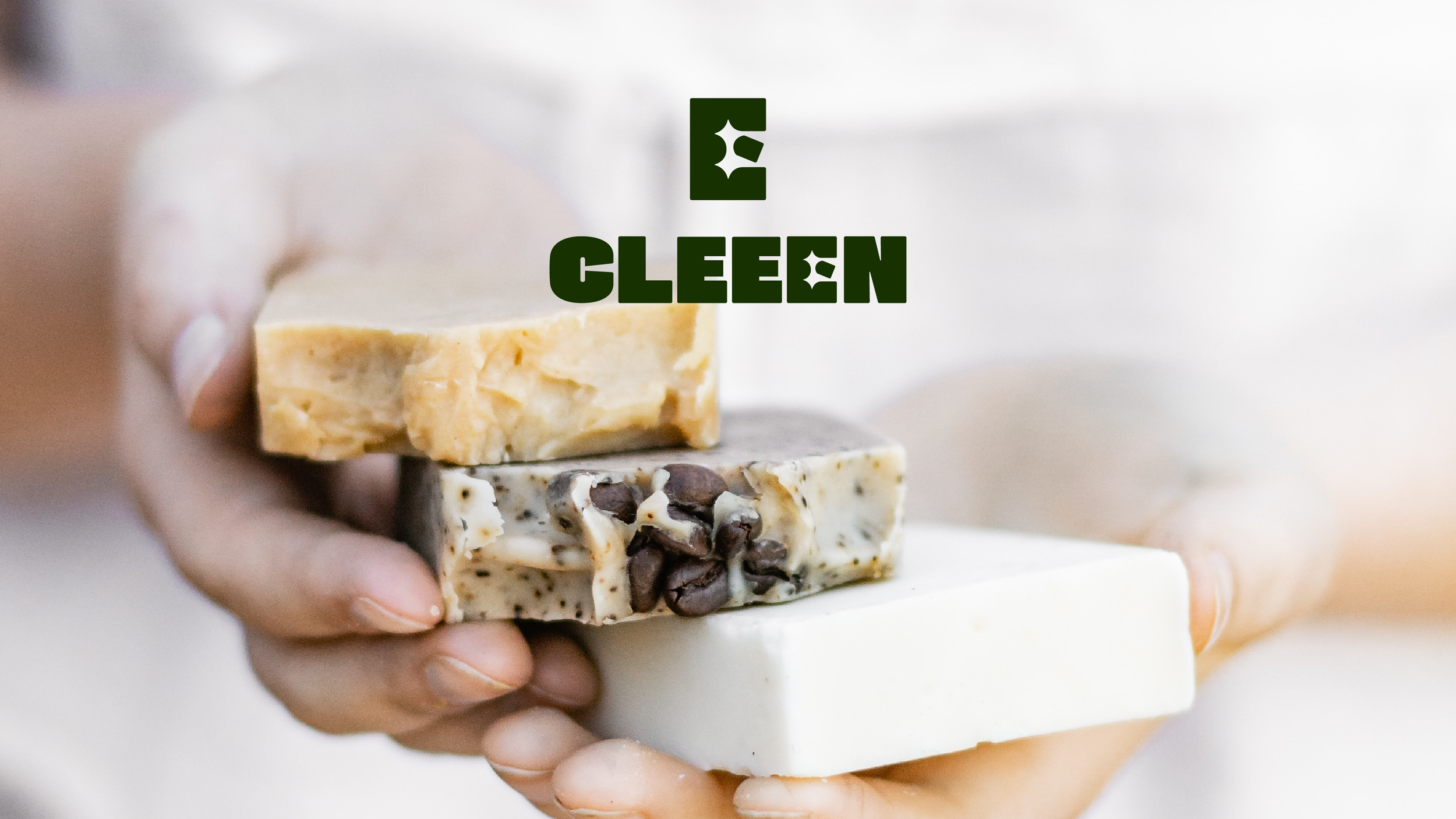
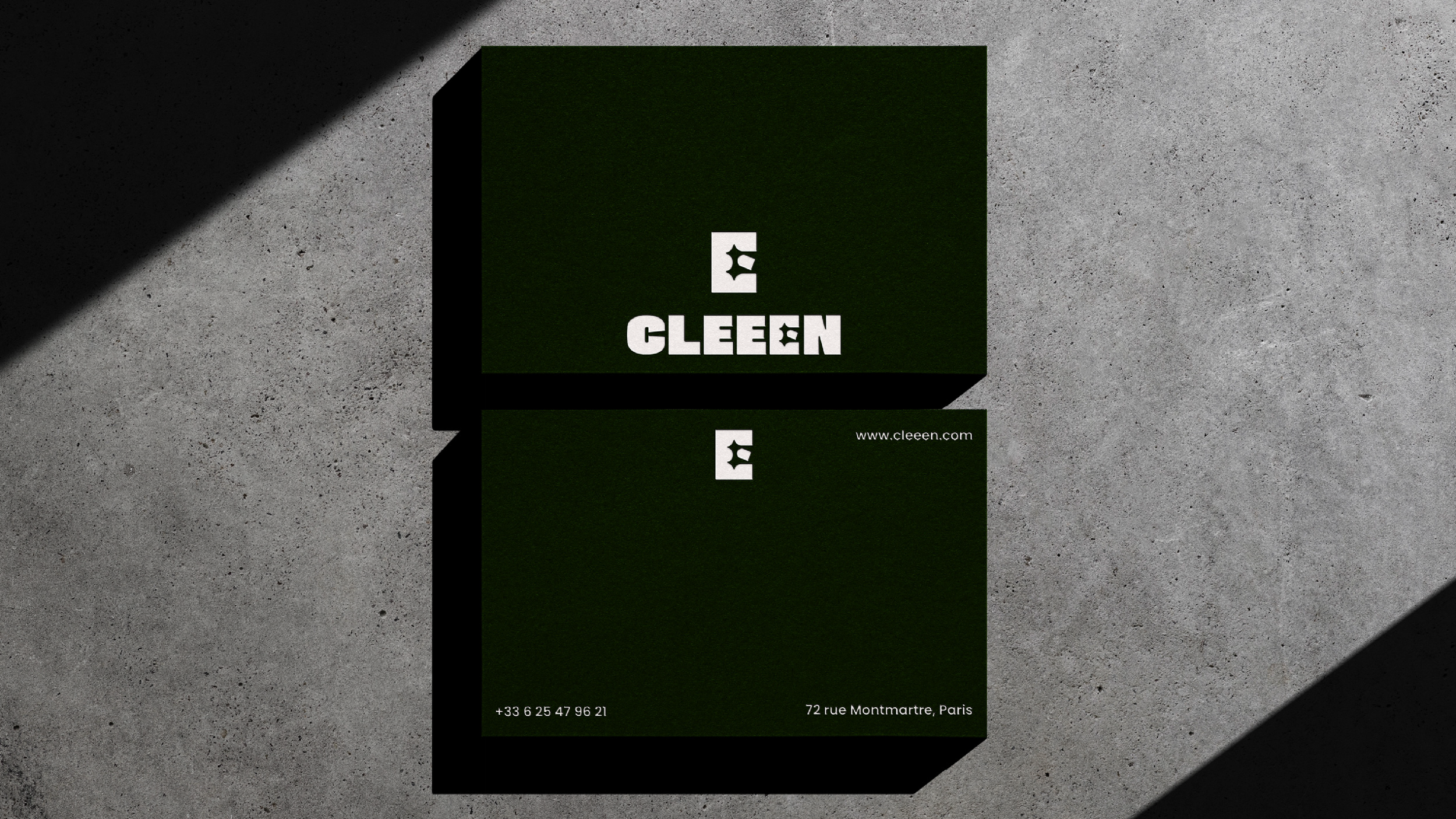
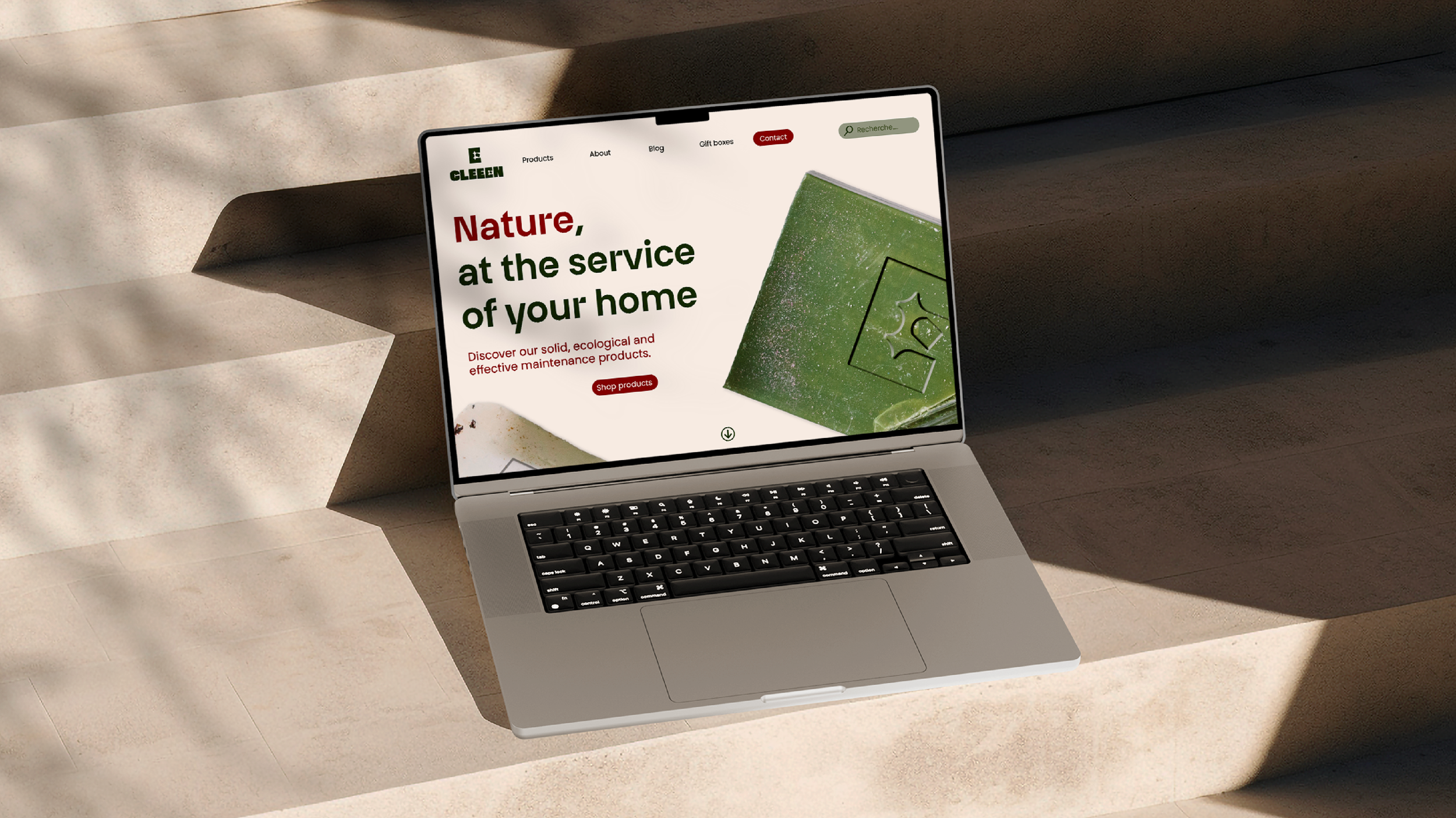
Cleeen is a brand of cleaning products. Their particularity: being solid and 100% natural. The range extends from laundry detergent to window cleaner and furniture polish. Their desire was to refresh the brand.
Services
Branding, Art Direction, Visual Identity
Project Overview
• Cleeen is a brand of eco-friendly, solid, and 100% natural cleaning products. The range includes everything from laundry detergent to window cleaner and furniture polish, offering sustainable alternatives to conventional household products.
• The goal of this rebranding was to modernize the brand’s identity, making it more engaging and aligned with its eco-conscious values while maintaining a professional and trustworthy look.
Color Palette
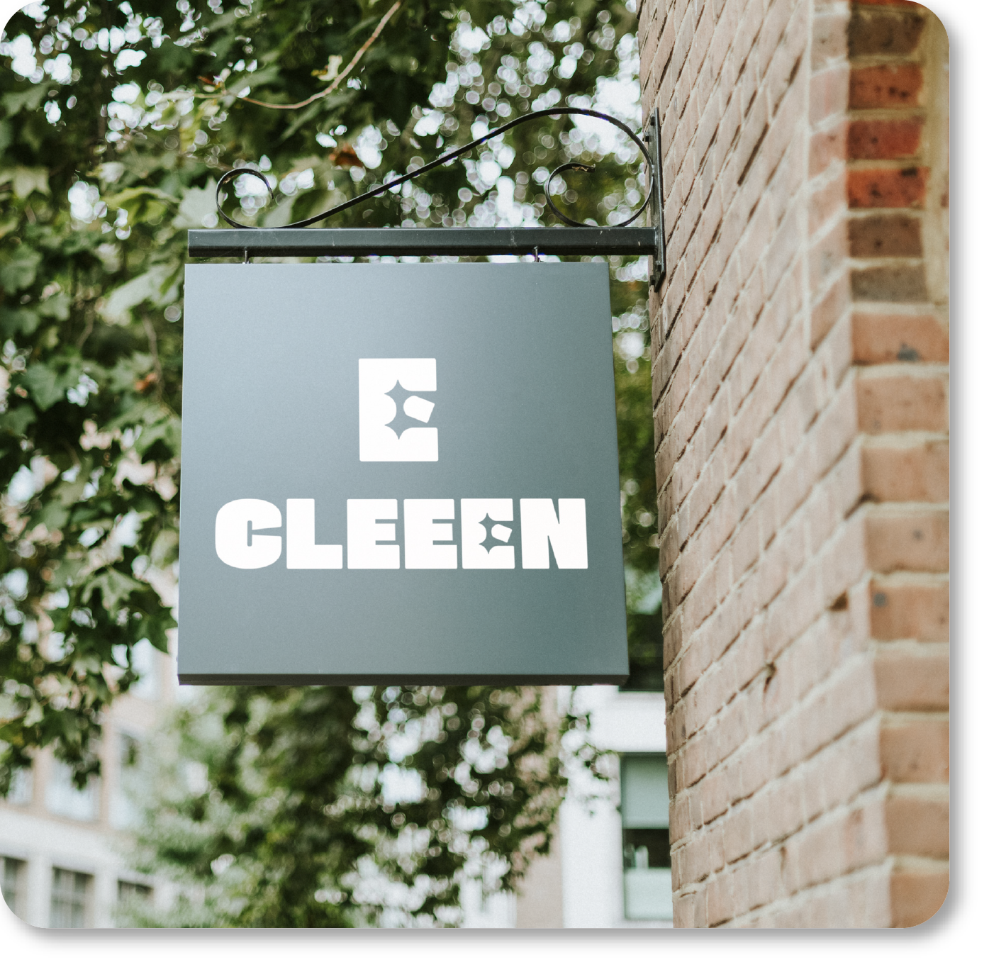
• Development of a fresh and minimalist brand identity that reflects Cleeen’s commitment to sustainability and simplicity.
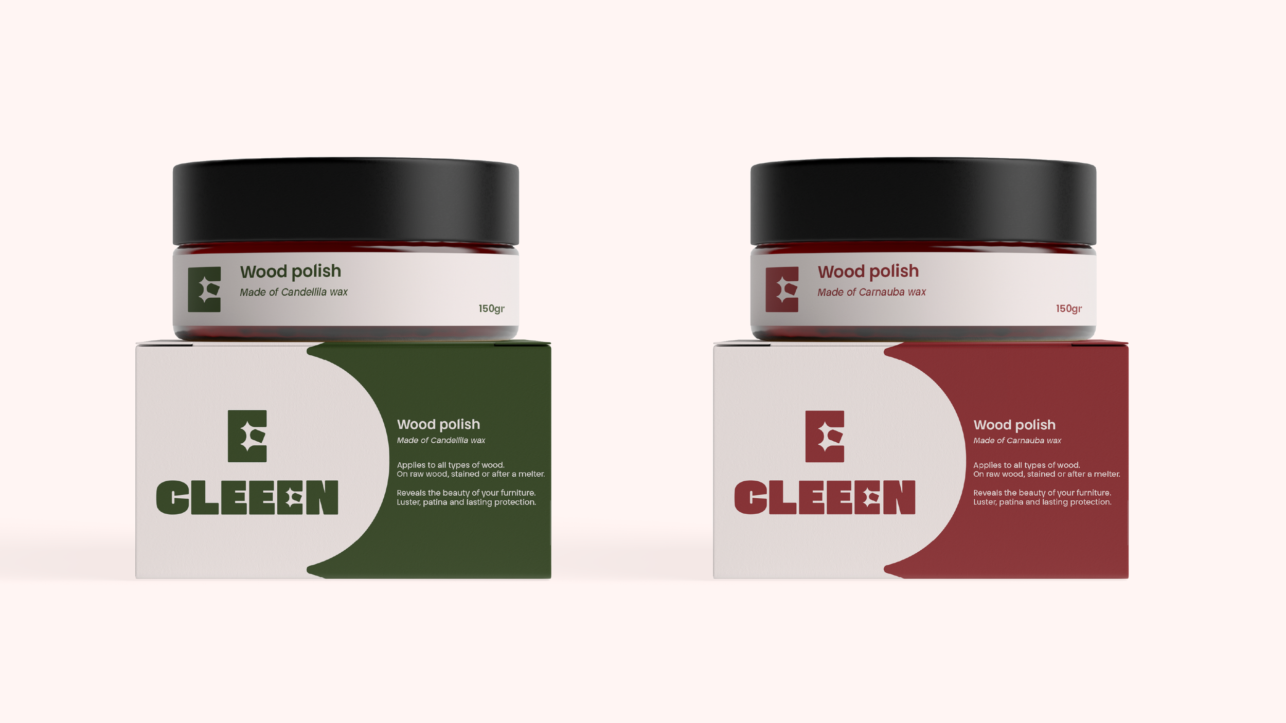
• Design of packaging and product labels that emphasize natural ingredients and the solid format of the products.
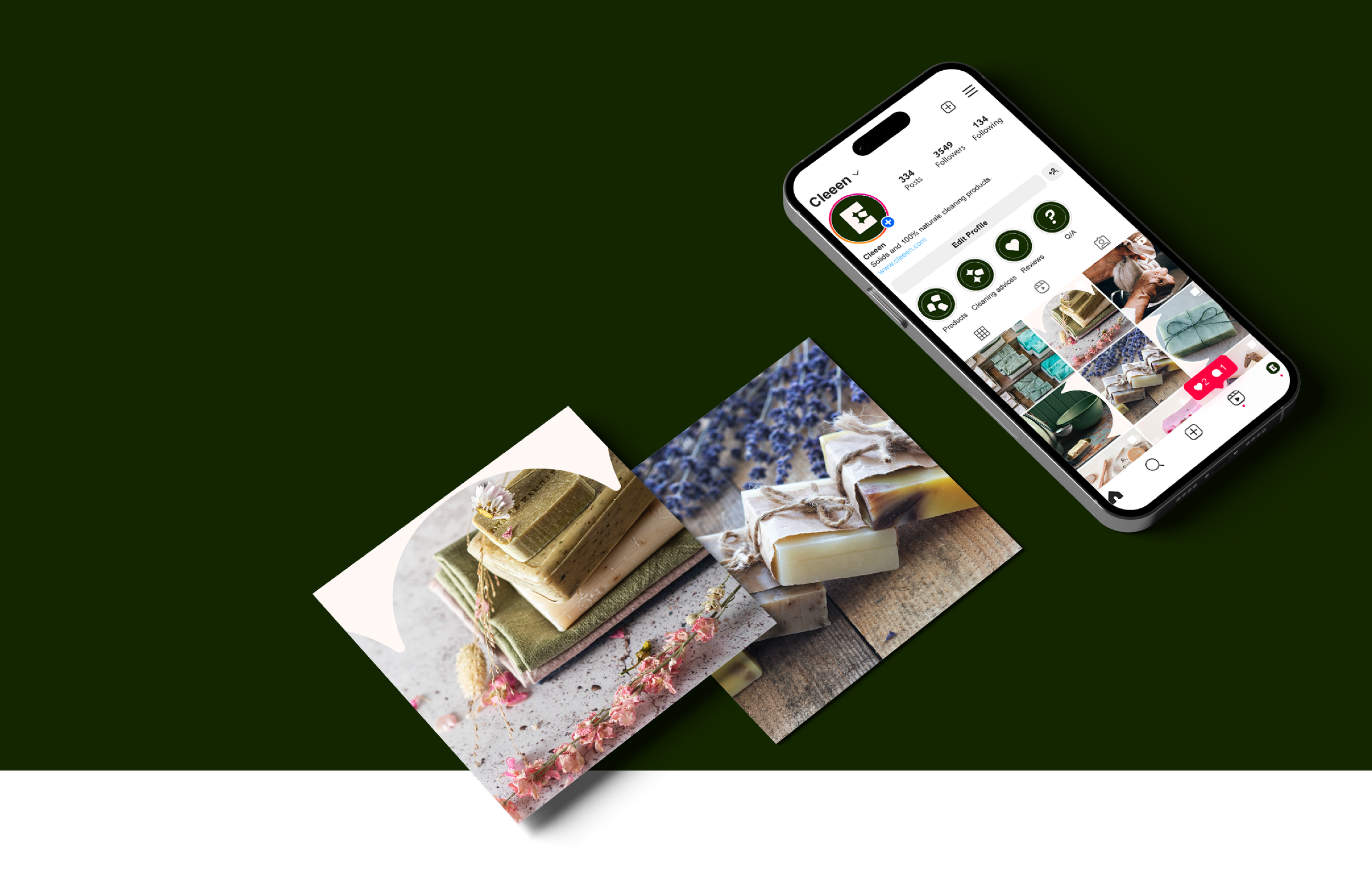
• Creation of marketing materials for digital and print, ensuring a consistent and impactful brand presence
Establishment of brand guidelines for typography, colors, and imagery, ensuring coherence across all communication channels.
Key Contributions
• The color palette blends soft green and earthy tones to reflect nature, sustainability, and the purity of Cleeen’s ingredients, while clean white and neutral shades enhance the minimalist aesthetic and evoke cleanliness.
• This combination creates a calm, trustworthy, and eco-conscious visual identity, positioning the brand as both premium and environmentally responsible.
• A modern, sans-serif typeface for its clarity and simplicity, ensuring that all communications whether on packaging, digital platforms, or printed materials remain legible and visually appealing.
• The typography communicates both professionalism and approachability, aligning with Cleeen’s mission to make sustainable cleaning accessible to all.
Typography
MORE
PROJECT
TechSprint
La Puzzlerie
Mingle
Rélévo

